In this article
Most landing pages don’t fail because of design. They fail because the creator built them by copying what they’d seen elsewhere, without understanding what any element was supposed to do. High-converting landing pages aren’t beautiful. They’re precise. They match exactly one visitor intent to exactly one action. This article breaks down what that looks like across three page types, with the benchmarks that tell you whether yours is working.

What Does “High-Converting” Actually Mean for a Landing Page?
A landing page conversion rate measures what percentage of visitors complete the page’s one intended action — subscribing, registering, or buying. Per Unbounce’s conversion benchmark research, the median landing page conversion rate across industries sits at roughly 3–5%, while the top 25% of pages convert at 10% or higher. “High-converting” means different things depending on the page type and traffic source.
The label “high-converting” is relative. A 5% conversion rate on a sales page for a $500 course is strong. A 5% conversion rate on an email opt-in page means something is wrong with your lead magnet offer, your traffic source, or both.
What the best examples have in common isn’t a template. It’s a discipline: they do fewer things, better.
| Page type | Typical conversion range | What counts as strong |
|---|---|---|
| Email opt-in / squeeze page | 15–35% | 35%+ from warm traffic |
| Sales page (course or digital product) | 1–3% from cold traffic | 3–7% from warm email list |
| Webinar registration page | 20–40% from email list | 40%+ from engaged subscribers |
| Lead magnet landing page | 20–40% | 40%+ with strong offer match |
| SaaS free trial or freemium | 3–8% | 10%+ |
Ranges based on conversion benchmark data from Unbounce and WordStream research across creator, SaaS, and coaching contexts.
The pattern here is consistent: warmer traffic converts higher regardless of page type. A visitor from your email list knows you. A visitor from a cold ad does not. Many landing page problems are actually traffic-quality problems — but the page design matters too.
What Do High-Converting Opt-In Pages Actually Include?
A high-converting opt-in page converts 25–40% of visitors into email subscribers. The examples that hit this range share five structural elements: a single, specific promise in the headline; a lead magnet the visitor wants right now; three or fewer bullet points; one form field (email only); and a CTA button that names the outcome, not the action (“Send me the template” not “Submit”).
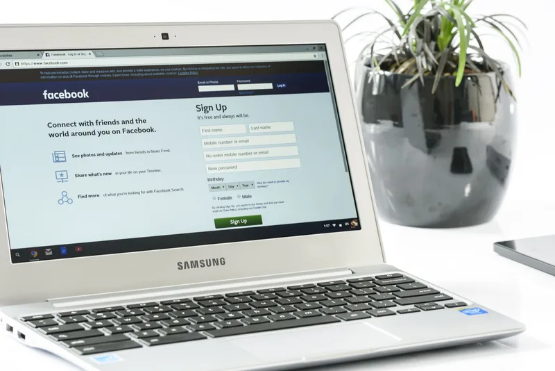
The best opt-in pages feel almost too simple. That simplicity is earned through specificity in the headline. “Get the free guide” does not convert. “Get the 3-email welcome sequence template that turns new subscribers into buyers” converts — because the visitor immediately understands what they’re getting and why they want it this week.
The opt-in pages that underperform usually have one of these problems:
Too many form fields. Every additional field reduces completion rate. Name plus email is not two fields — it’s a measurable drop in conversions versus email only. Ask for only what you’ll use in the first email.
A generic lead magnet. “The ultimate guide to email marketing” is not a lead magnet. It’s a category. High-converting examples offer something the visitor can use this week — a template, a checklist, a swipe file with a specific application.
A CTA button that says “Submit.” The button on a high-converting opt-in page says what happens next: “Send me the template” or “Get the free checklist now.”
If you are building a squeeze page for the first time, the single most effective change you can make is to name the specific outcome in both the headline and the CTA button. Everything else is secondary.
What Makes a Sales Page Convert at 3% or Higher?
A high-converting sales page for a digital product typically converts 1–3% from cold traffic and 3–7% from a warm email list. The examples that hit the upper range share a common structure: they open with the reader’s problem (not the product), establish credibility before naming the price, and place the CTA button at least three times — above the fold, after social proof, and at the bottom.

Most solo creators write their sales page in the wrong order. They open with “Hi, I’m [name] and I created this course because…” — which is not what the visitor wants to know first. High-converting sales page examples open with the reader’s situation. “You have 2,000 email subscribers and you’ve made maybe three sales. You can’t tell if the problem is your email sequence, your offer, or your price.” That is a hook. The creator’s backstory can come later, after the visitor has confirmed this page is for them.
The elements that appear in sales page examples converting above the industry median:
- A specific, measurable outcome in the headline. Not “Transform your business” but “Get your first 10 paying clients without running ads.”
- Objection handling before the buy button. High-converting pages anticipate the three things that stop purchase decisions and address them before the visitor can close the tab.
- Social proof positioned after the offer, not before. Testimonials placed too early read as defensive. After the offer, they read as confirmation.
- A simple FAQ section. Not generic questions — the three or four actual objections your buyer has, answered directly.
Is your landing page getting traffic but not converting? The problem is often upstream, not on the page itself. A funnel diagnostic shows you exactly where people are dropping off — before you spend time redesigning anything.
What Does a High-Converting Webinar Registration Page Include?
A webinar registration page converting 20–40% from an email list does three things: makes the transformation in the title explicit, shows a clear date and time, and reduces the ask to one click. Registration pages that underperform typically bury the “what’s in it for me” under a biography, a list of topics, and trust badges that add friction without adding value.

The webinar registration pages that convert well are shorter than you’d expect. If you’re promoting to your own email list, your visitors already know you. They don’t need a biography. They need to know: what will I be able to do after this webinar that I can’t do now? What day and time? How long is it?
Three things that reliably improve webinar registration conversion:
Specificity in the title. “Grow your business” does not work. “The three-step client attraction framework I used to go from 0 to 12 coaching clients in 90 days” does — because the visitor can immediately picture whether this is for them.
One registration field. Name and email versus email only is a measurable drop in registrations. Get the email. You can ask for the name in the confirmation email.
A concrete time commitment. “60 minutes” or “45 minutes, including Q&A” reduces hesitation. Uncertainty about how long something takes is friction.
Which Elements Appear in Every High-Converting Landing Page?
Across opt-in pages, sales pages, and webinar registrations, the examples that convert above the industry median share four traits: a headline that names the specific outcome (not the product), a single conversion action on the page, social proof positioned where doubt appears, and a CTA that states what happens next. These four appear in every high-performing example regardless of niche or price point.

The patterns that appear in every high-converting example are not design trends. They’re decisions about what to remove.
The single conversion action is the most important. Landing pages with multiple links — “sign up, or read more, or follow me on Instagram” — consistently convert lower than pages that remove all exit options except one. The exits you leave open are the exits people take.
Social proof placement matters more than volume. One specific testimonial placed at the point of hesitation — just before or just after the CTA — outperforms eight testimonials stacked at the bottom that nobody scrolls to. The question every visitor is silently asking is “did this work for someone like me?” The testimonial that answers that question, placed at the right moment, is the one that moves people.
The outcome-focused CTA is the most underused tactic on solo creator pages. “Download now” is about the action. “Get the 3-email welcome sequence template” is about the outcome. Visitors click outcomes.
What happens after the page matters just as much as the page itself. A well-structured welcome email sequence that delivers on the promise you made on the landing page is the second gate your funnel has to pass. If the experience after the opt-in doesn’t match what the page promised, you’ll see unsubscribes before your first nurture email lands.
Frequently Asked Questions
What is a good conversion rate for a landing page?
A good conversion rate depends on the page type and traffic source. For email opt-in pages, 20–35% from warm traffic is a solid target. For sales pages, 1–3% from cold traffic and 3–7% from an email list are typical ranges. Anything below 1% on an opt-in page warrants investigation — the problem is usually the lead magnet offer, the headline, or a mismatch between your traffic source and your audience.
Does landing page length affect conversion rate?
Yes, but not the way most creators assume. Short pages (under 300 words) convert well for simple, low-commitment offers like a free opt-in. Longer pages are needed for higher-ticket offers where the visitor requires more information before committing. The rule is not “shorter is better” — it is “as long as the offer requires, and no longer.” A $49 template needs less copy than a $997 coaching program.
Does adding social proof increase landing page conversion?
Based on research from Unbounce and the broader conversion rate optimization community, social proof improves conversion when it is specific and positioned correctly. A generic “People love this!” badge adds almost nothing. A specific testimonial from someone who matches the visitor’s profile, placed just above or below the CTA, reduces purchase hesitation — because it answers the silent question: “Did this work for someone like me?”
What is the most important element on a landing page?
The headline. If your headline doesn’t immediately confirm that the page is relevant to the visitor’s situation, they leave. The best headline examples from high-converting pages follow a pattern: name the specific outcome the visitor will get, for a specific type of person, ideally within a timeframe or context. Everything else on the page supports that headline.
Why are most landing pages not converting?
The most common reasons are an unclear value proposition, too many competing calls to action, and a mismatch between the ad or email that sent the visitor and what the landing page actually says. Per Unbounce’s conversion benchmark research, the fix rarely requires a full redesign — it usually requires one targeted change: making the headline match the intent of whoever clicked.
Keep Reading
What to Do Next
Choose the path that fits where you are right now.
Get the Free Solo Funnel Diagnostic
Get the free Solo Funnel Diagnostic. 12 diagnostic questions. Scored in 10 minutes. Tells you exactly which stage is broken and what to fix first.
Send Me the Diagnostic